

ROCKY PEAK INC / CASE STUDY
Rocky Peak
Overview
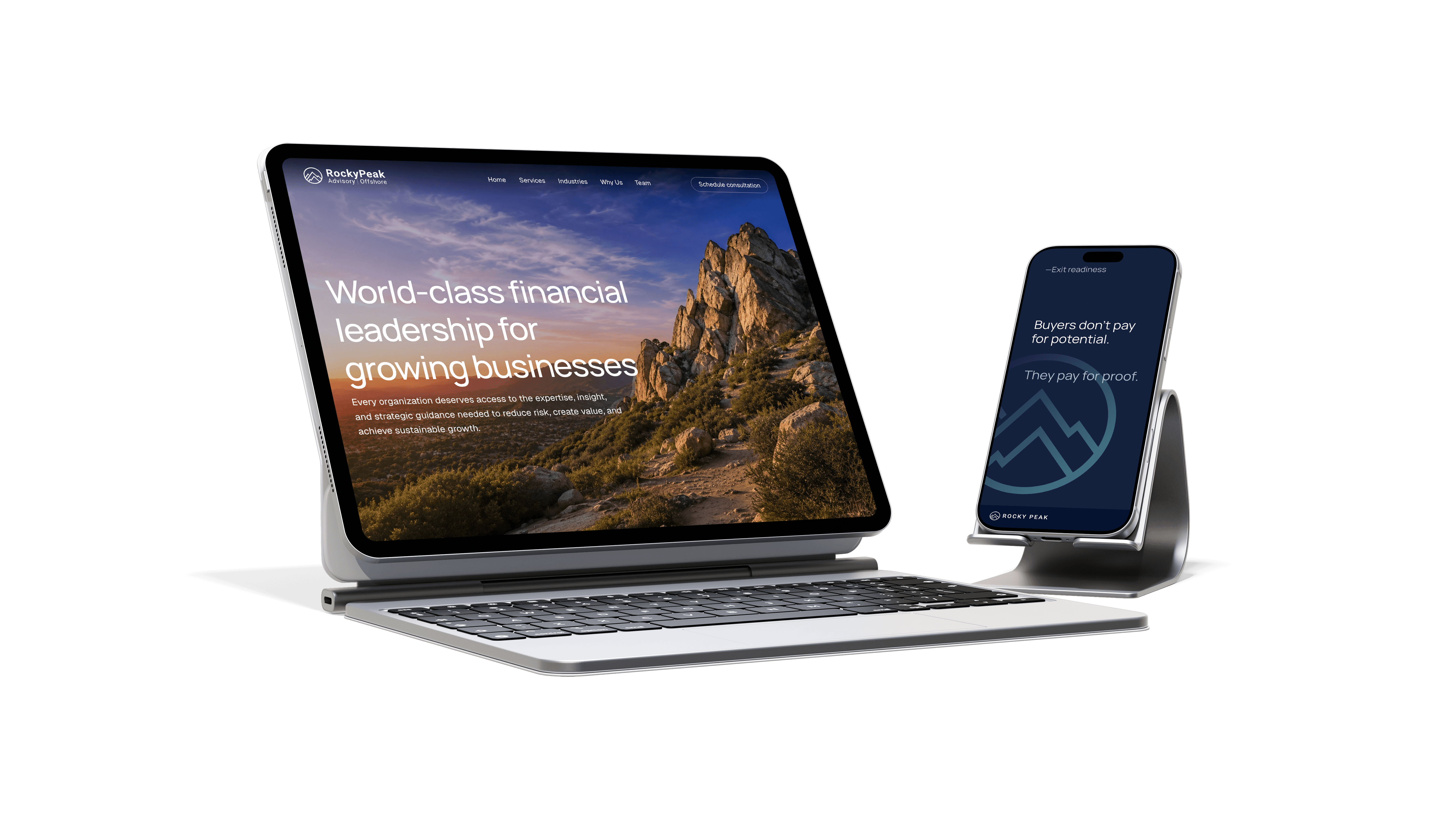
Rocky Peak Inc. is a newly established professional services firm seeking to build a distinctive brand identity, develop a modern digital presence, and strengthen its marketing strategy to support growth, credibility, and long-term market positioning. This initiative will establish a cohesive brand foundation that effectively communicates the company’s specialized expertise and value to prospective clients and partners.
From Strategy
to Execution
We began with a brand core strategy session to define who Rocky Peak is and who it serves — resulting in a clear brand direction statement, a target client persona, and a defined look and feel. From there, we built out the full visual identity and crafted copy throughout the website, ensuring every touchpoint reflects the same strategic foundation from the ground up.


Logo Mark
The Rocky Peak mark traces a summit through three rising ridgelines — a profile that doubles as a growth chart, echoing the upward path we build toward for every client. Rendered in a single weight with a navy-to-teal gradient, it favors geometry over ornament, giving it the precision to scale from favicon to building sign and the timelessness to endure for years to come. The circle frames it all: a horizon around the ascent, and a quiet symbol of the discipline behind the climb.



Brand Direction
Rocky Peak partners with middle-market businesses, private equity firms, and venture-backed companies to drive value creation, reduce risk,
and increase enterprise value through collaborative, hands-on financial leadership and accessible Big 4-caliber expertise.

Additional projects


Design centered around the human experience.